Home Page Design Concepts
CONTENT
INTRODUCTION
INSPIRATION
EPIC HERO
BUILDING BLOCKS
TRIANGLES
Introduction
ImageArb is a full-service creative and web shop focused on financial services and private equity. Their site will be used as a validity check which will also showcase their best work along with testimonials and client logos. The home page redesign will set the tone for the rest of the site; hence, it needs to be stunning and professional.
In addition the client did not want the home page to be parallax; they wanted a slider to be set with rotating screens.
Thus, we presented three design concepts: 1) Epic Hero, 2) Building Blocks, 3) Triangles
Logo & Color Palette

Inspiration
Based on the information the client provided us with their preferences and dislikes, I sourced the internet for web design inspiration.
Photography Centric Sample

Web design sourced for reference.
Typography Centric Sample

Web design sourced for reference.
Illustration Centric Sample

Web design sourced for reference.
The Wildcard Sample…
loads of white space with a pop of color
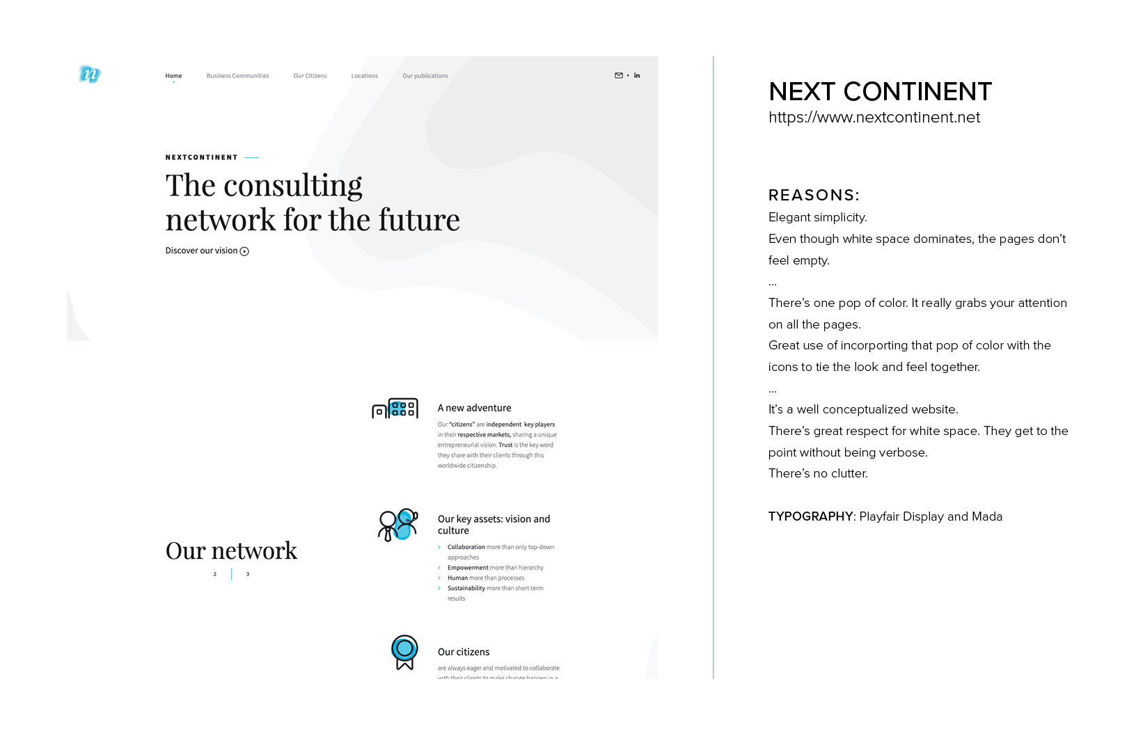
Web design sourced for reference.
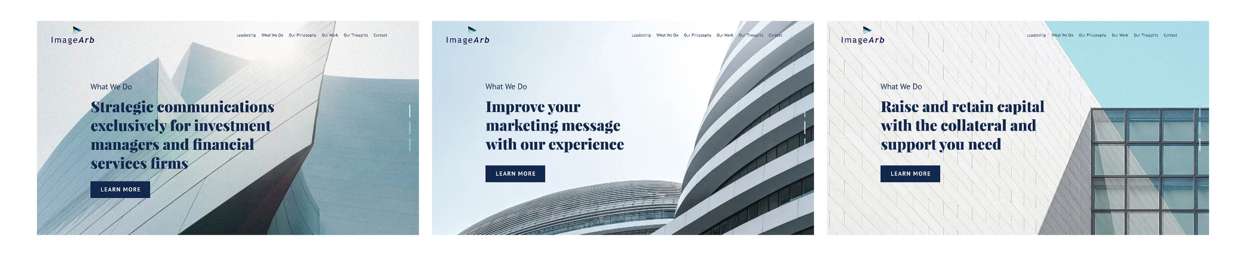
Epic Hero
This comp features dramatic, full-width and full-height hero images.
I chose images of modern buildings against a pale background.
My reason for choosing these images is that it represents business and finance. Every building requires capital.
Typography: PT Sans + Playfair Display
Building Blocks
This comp features blocks: text blocks and image blocks. Overlapping blocks, staggered blocks. It’s an homage to ‘the building blocks of raising capital’.
I chose black and white images of powerful or grand structures.
Typography: Aktiv Grotesk + Abril Fatface

Triangles
This comp features motion graphics of the ImageArb logo mark as well as designs that incorporate the use of triangles.
I chose to only use the logo mark and triangles because I wanted to play up to ImageArb’s brand. By keeping the graphics uncomplicated, we’ll let the message shine through and be the leading lady. The triangles are pointing forward and up to signify progress and gaining capital.
Typography: Open Sans + FreightBig Pro
